Small Beginnings
The ins and outs of my art piece at burning man this year

Introduction
What if you could place a line of development through an artist’s lifelong work? Take Claude Monet, for instance. You start with his scribbles at one year of age. Then you see him start to improve at two years of age. And before you know it you get to the Haystacks, Water Lilies, and his other impressionist works known the world over. If you follow this line of development you’d see the evolution of the artist’s internal state of consciousness from nascent to mature, nuanced, integrated, and complex. And you would see an idea go from humble origins to full fruition.
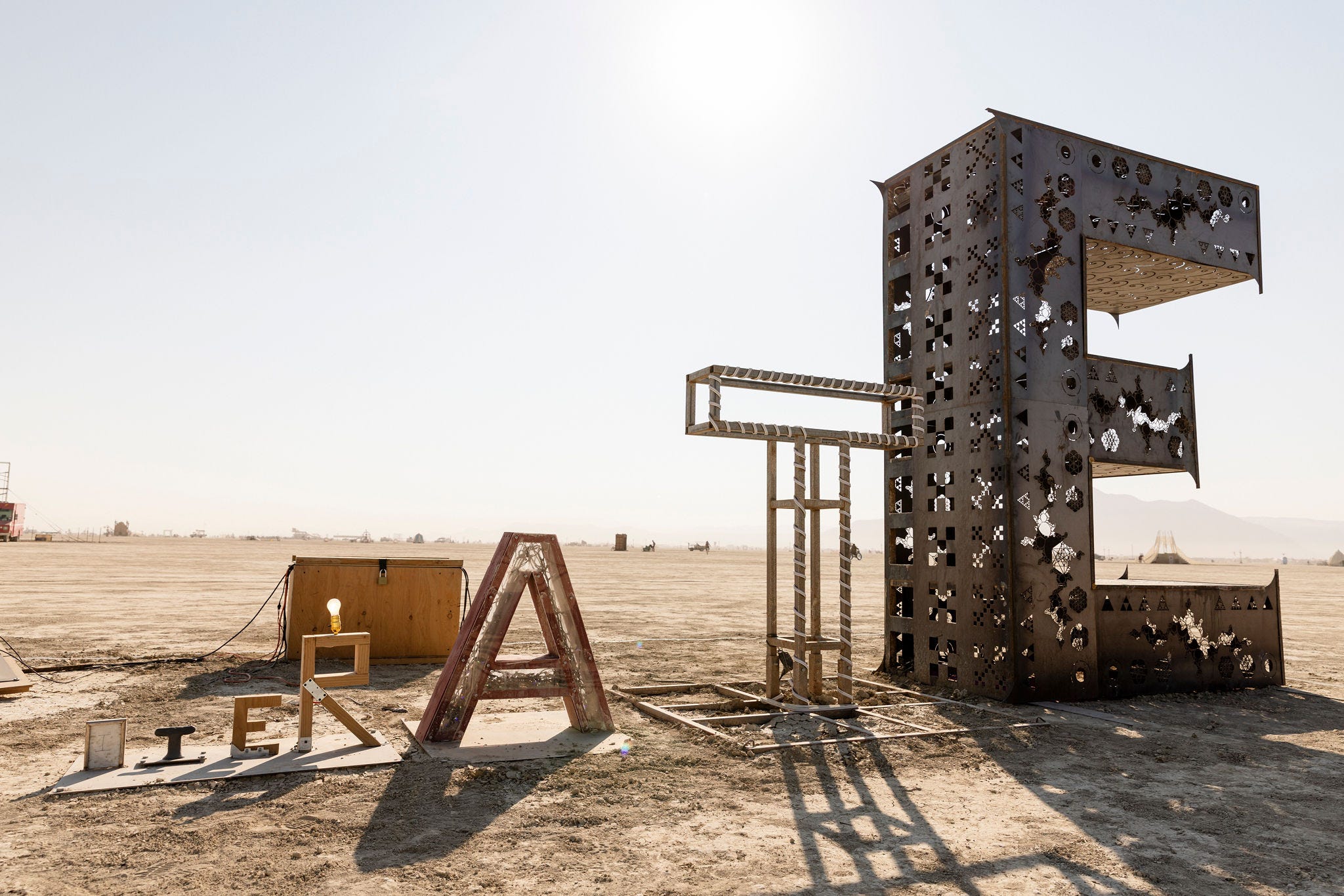
This was the inspiration for my most recent art piece at burning man. It took the form of a word sign where each progressive letter doubles in size, from a two inch tall I to an 11 foot tall E. The word is ITERATE. Each letter is made of different materials and evolves in terms of build quality, size, and complexity. And it recharged off of solar in the day and was illuminated at night.
Here I’ll walk you through the ins and outs of this art piece a year in the making.
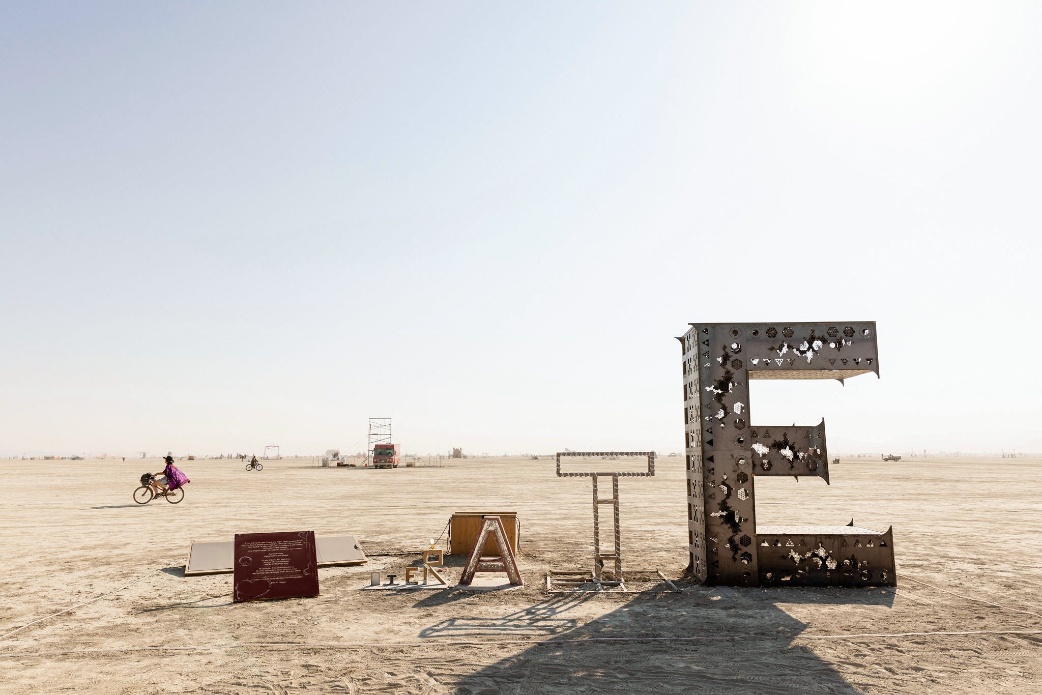
Small Beginnings after a week in the dust. Photo credits at the end.
Background
One of the earlier forms of this idea of representing the increasing complexity of consciousness was to choose an artist and show their literal progression with representative artworks from year to year. This would show their evolution along a single axis with the messiness, false starts, and switches between styles and artistic mediums. But this approach was too married to an individual artist and didn’t quite represent the core idea. So I went back to the drawing board on how to create this strange idea.
Exponentials are notoriously hard to reason about. Humans have oh so many cognitive biases. Two big biases are that we think about the world linearly and locally. But exponentials are everywhere around us. Fractals, population growth, and compound interest are a few examples. So as I sat with the idea of creatively representing the progressively compounding evolution of a system, a sequence exponentially increasing in size was a key component.
But systems not only compound in terms of size. There’s also complexity. Monet’s early caricatures (he started as a caricature artist) are certainly smaller than the massive Water Lilly paintings made at the end of his life, but they also represent a depth of consciousness from a lifelong artistic pursuit. So the next dimension of compounding became the complexity. Each progressive letter had more detail, fewer rough edges, better lights, and deeper intention.
Material and time spent creating the letters were additional dimensions of the progression. Each progressive letter was twice the size and took roughly twice the time to create as the previous one. If I were a true purist, I would have made the letters in that progression, timelines be damned. But the reality was that after making the I (it took me a few seconds), I had to focus on the E so that I could make my deadline for shipping it to playa. So I rewired the electricity in my garage, taught myself to weld, and got to work.
While in the build process, I re-read the Tao Te Ching. Known as “The Book of the Way and Virtue,” this is the foundational text of Taoism written around the 6th century BCE. From this collection of poems, one poem resonated with the core intent of the art piece. In it is the line “all great achievements come from small beginnings.” This is similar to the better known quote from the same book: “a journey of a thousand miles begins with a single step.” I named the piece Small Beginnings after this poem and included it as a sign in front of the piece.
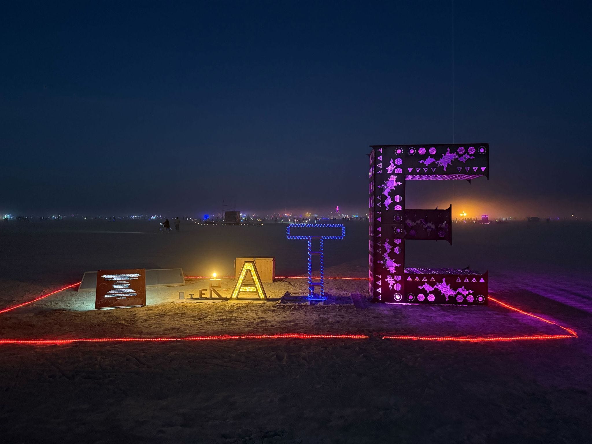
Small Beginnings at night.
The Piece Itself
The Visualization Exercise and Poem
The sequence begins with a visualization exercise. If you’re building something great, it can be daunting to start. So the exercise is to project out an idea into its full fruition. This is an exercise that builds intuition of a different reality. For the readers of Carl Jung, intuition can be opposed to sensing. Sensing focuses on immediate sensory information. Intuition maps information to deeper mechanisms, patterns, or possibility spaces. Deeply intuitive people leverage some integration of conscious and unconscious information in order to build a detailed internal map of the world. It's an art and a skill and this exercise (which I wrote) seemed to map well to bolstering one’s intuition. Following the visualization exercise in italics is the full poem from the Tao Te Ching.
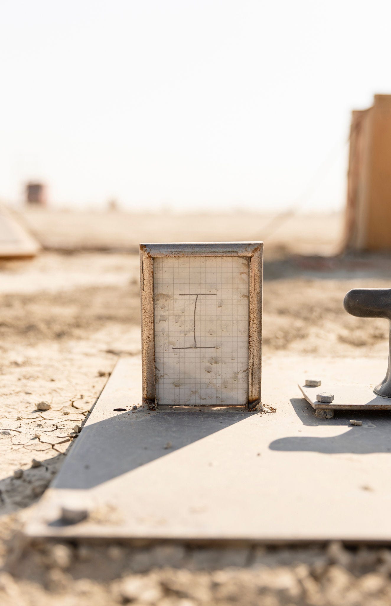
The I
Scribbled on a page from one of my notebooks, the I is the two inch tall beginning of the word. The page came from the notebook I was using when I first had this idea last year. It was the smallest step in the beginning of the larger project.
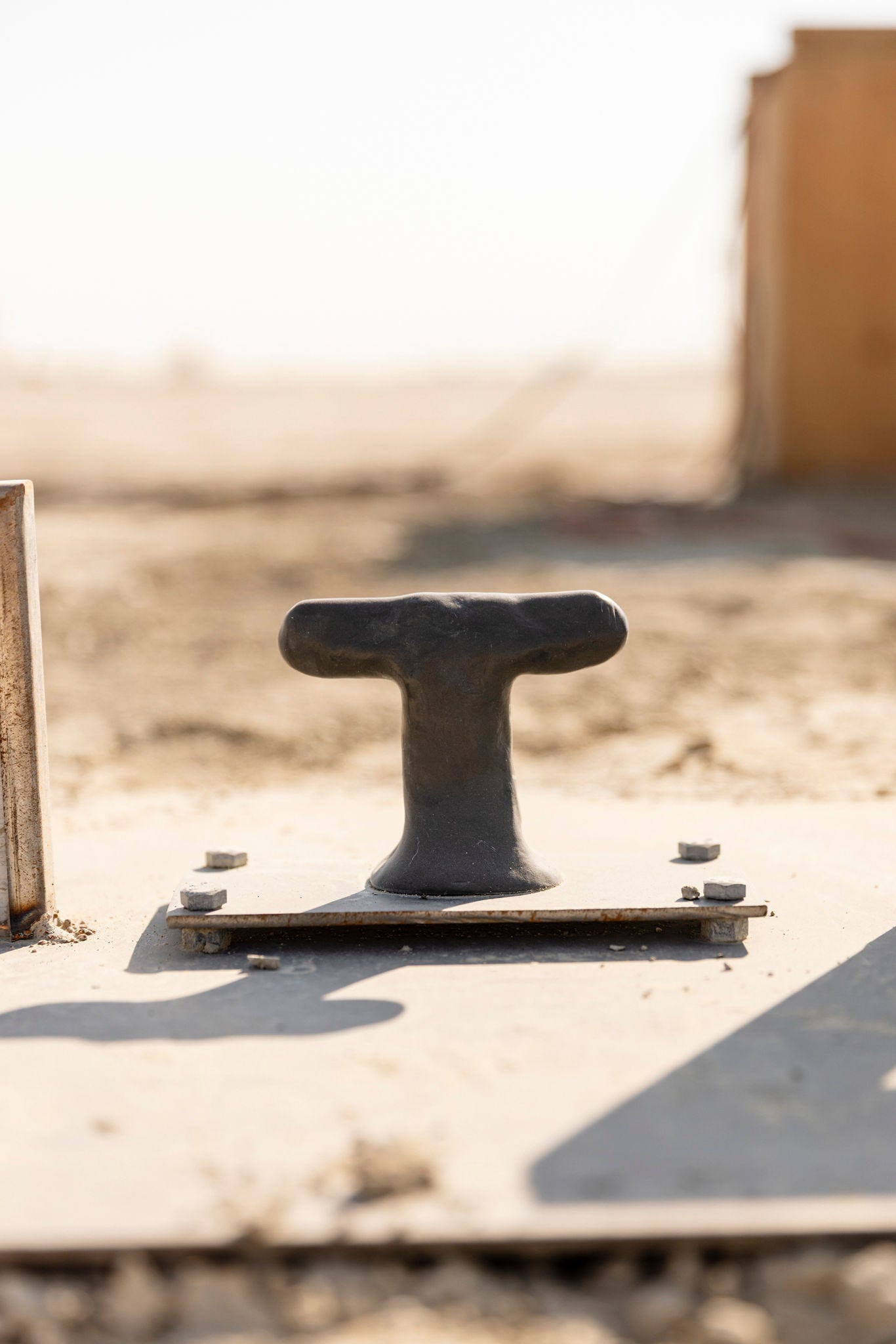
The T
I molded the T out of sculptor's clay. The inspiration here was automotive design which uses clay to form the design of a vehicle before putting it into a wind tunnel to test aerodynamics. The T seemed to me to be the next step of a design process moving from the two dimensional space to a three dimensional space while retaining the flexibility of clay necessary in the design process. And yes, you can’t work with clay without revisiting the Demi Moore and Patrick Swayze hit film Ghost, so we watched that while making the T.
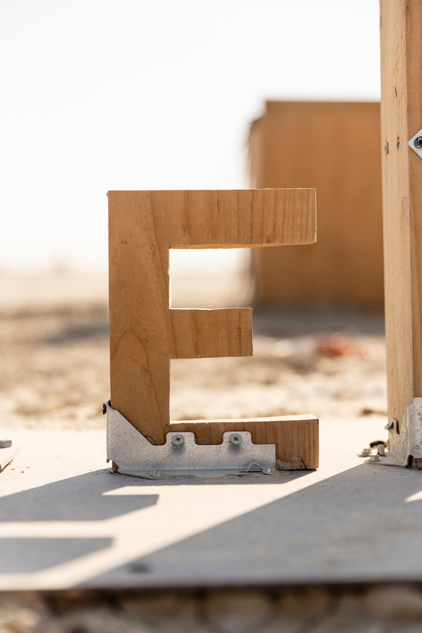
The E
This letter transitions from clay to wood. Haphazardly cut into a board using a jigsaw, it was a simple and easy way of creating something in a more permanent medium than clay.
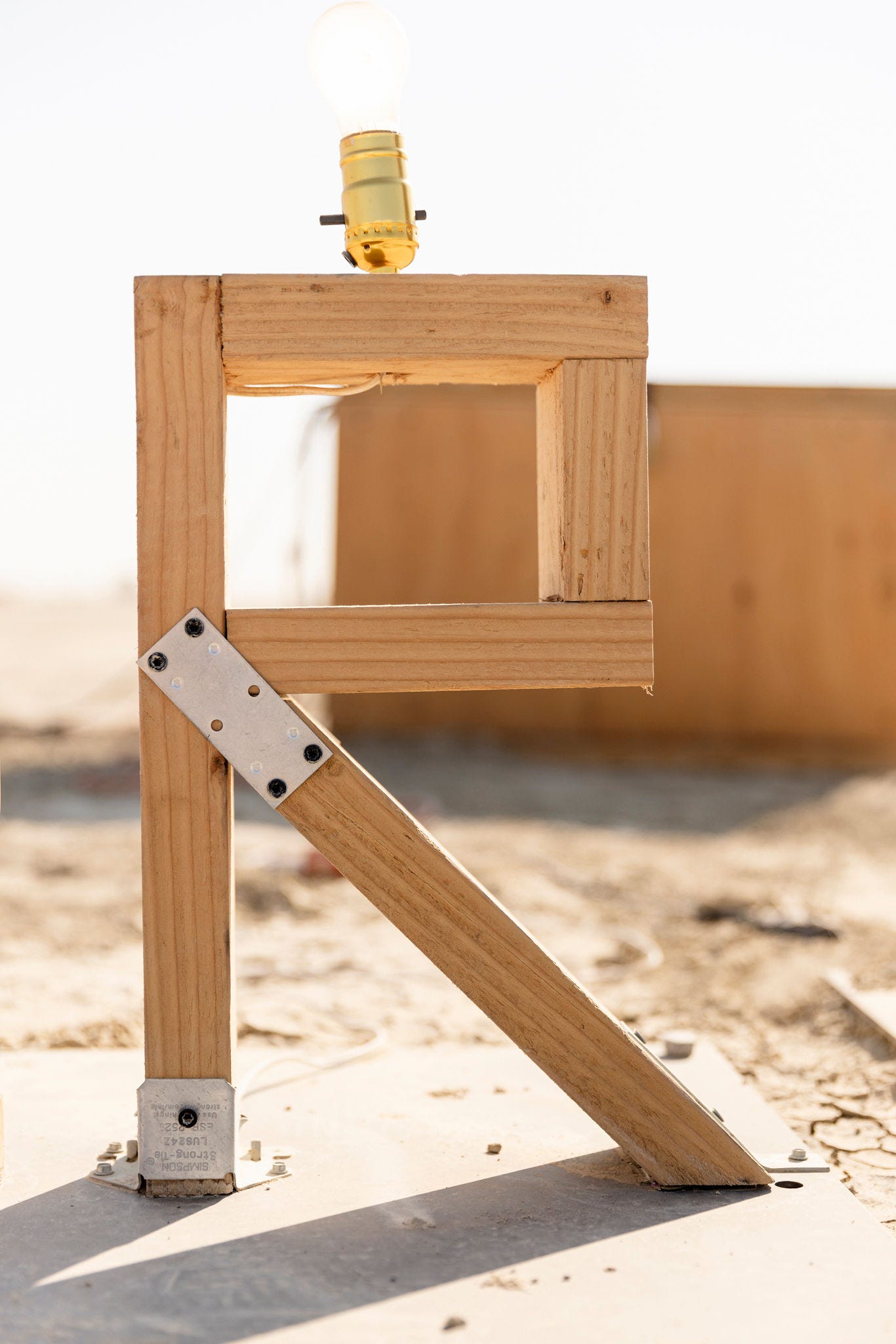
The R
This letter was the first to have its own lighting. Made from a 2x4, it also has a single lightbulb from the wiring of a lamp installed on top. With our camp art car playing music next to the art piece, I flipped the light on and off to the beat.
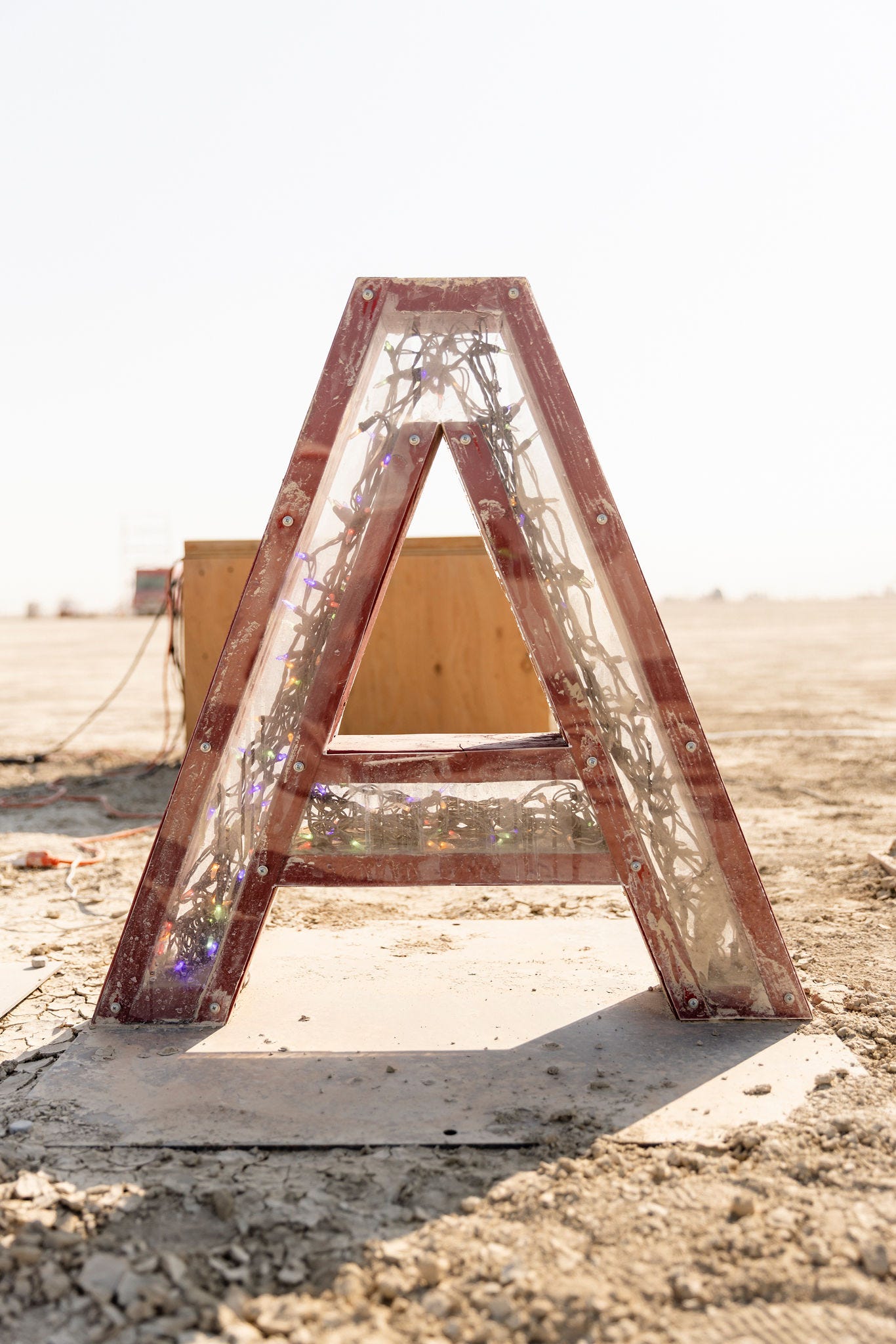
The A
This letter introduces color, acrylic, and more colorful lighting. I was deeply amused by putting flashing Christmas tree lights on the inside giving it an aesthetically weird feel. It had increased intentionality relative to the earlier letters but still a rough look and feel.
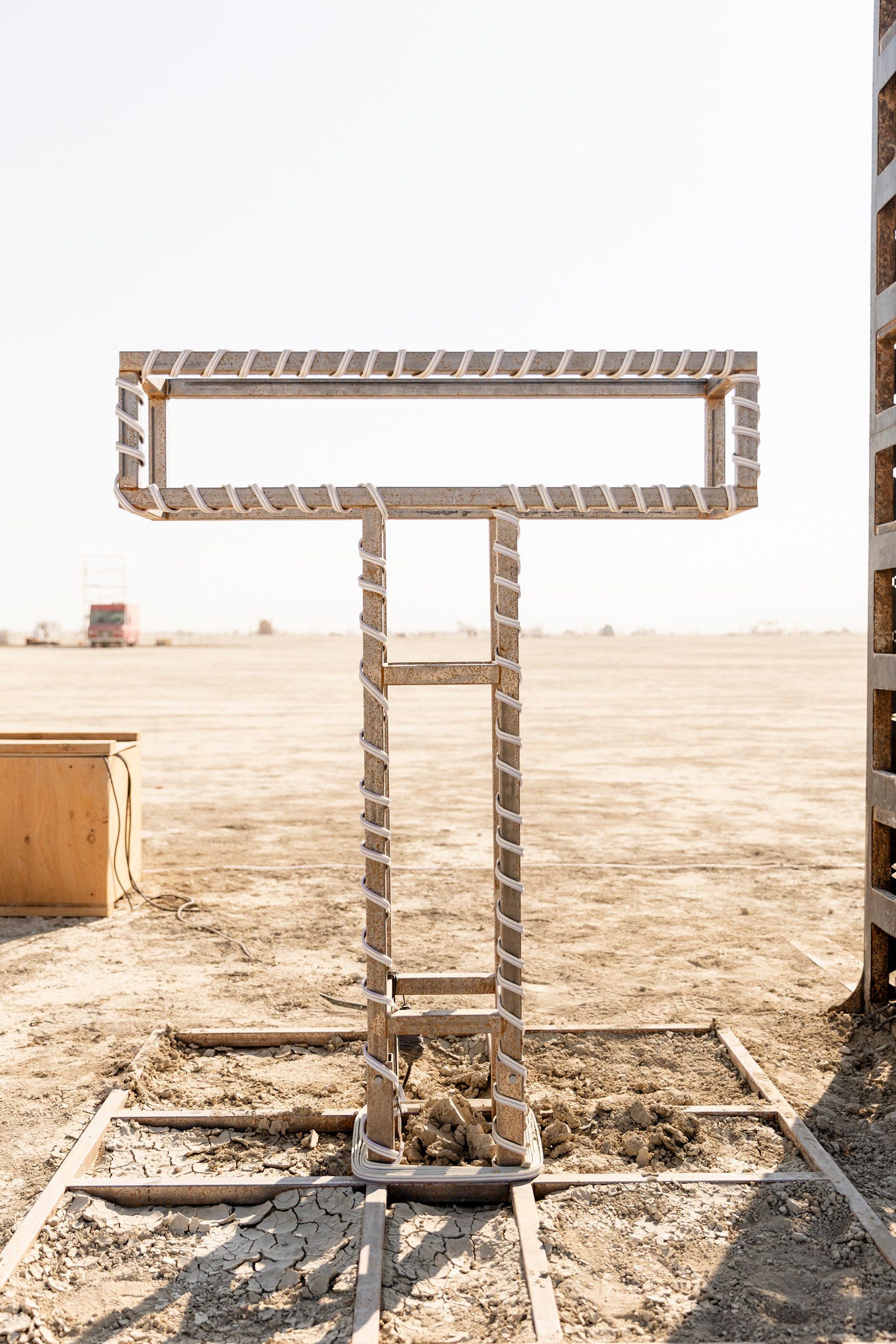
The T
The T transitions materials from wood to steel. Created quite simply and wrapped with rope lights, this letter was just shy of 5 ½ feet tall. This was the first climbable letter.
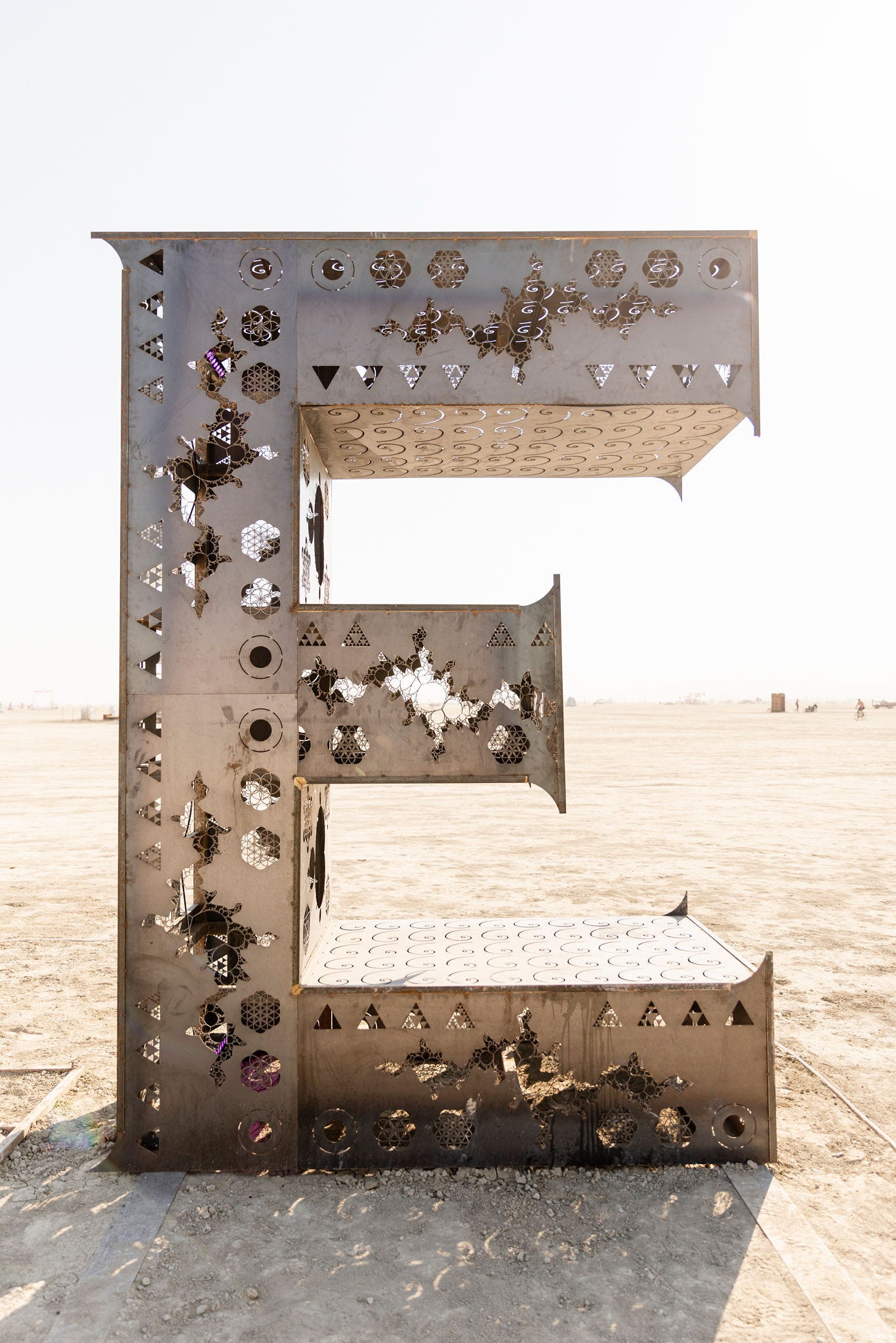
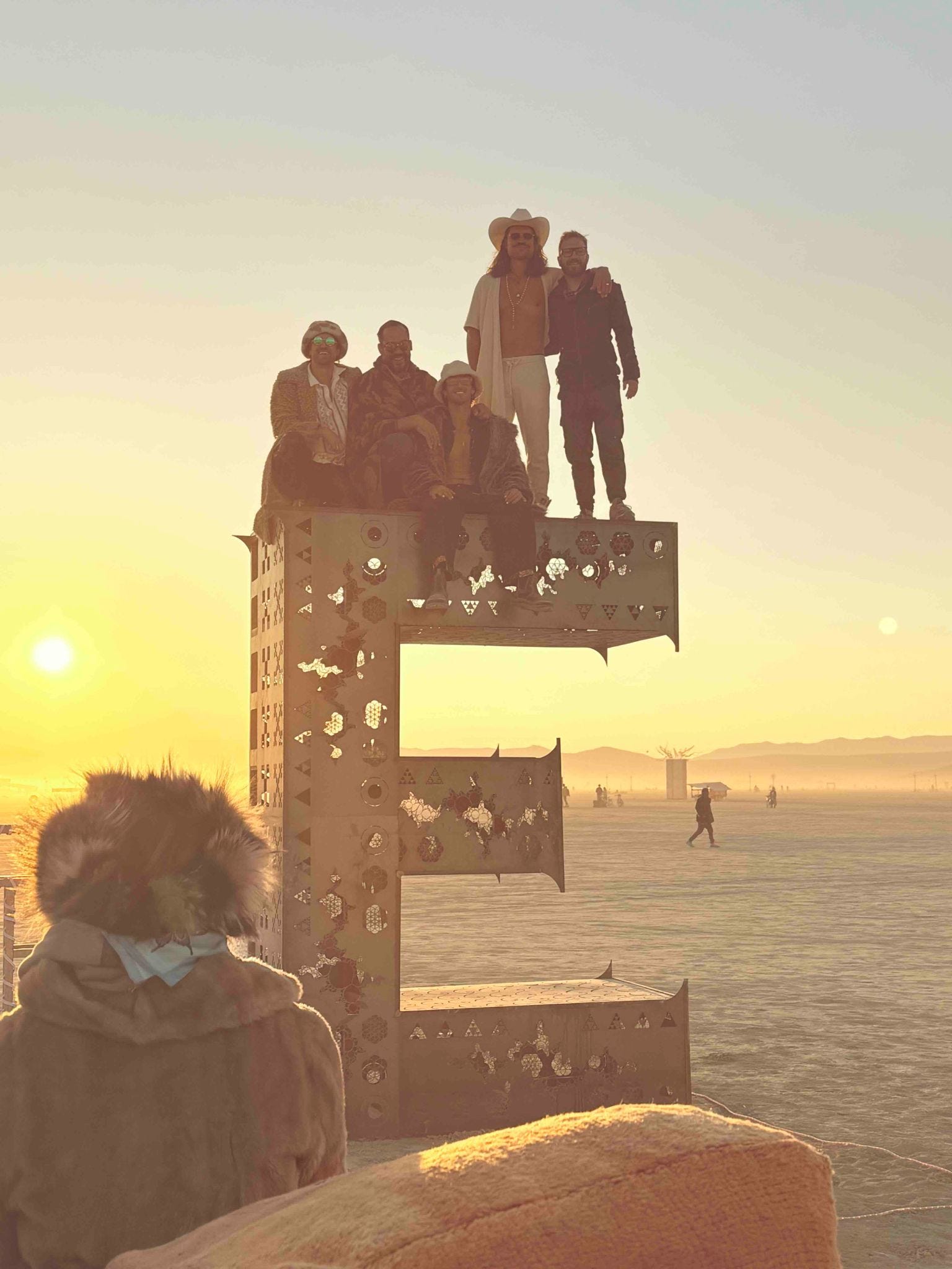
The Large E
The main focus of the piece is the final E. Just shy of 11 feet, it was laser cut steel full of fractals, fractal progressions, and the fibonacci sequence. The fractal sequence of squares on the side are climbable and the top is reinforced steel that could hold the weight of a small marching band. Inside are programmable wash lights. I got a lot of pleasure going out to the piece each evening at sunset, finding somebody hanging out on the E, and then asking them their favorite color. I’d then turn it on and switch the color to whatever they’d say and leave it on that color for the night.
The steel plates on the E were laser cut on a $600k laser cutter that was by far the most impressive piece of machinery I’ve ever seen. It had cooling towers for liquid nitrogen and created highly intricate designs. In it was all the geeky math and fractals I spend far too much time noodling on in my free time. Cut into the E were the Mandelbrot set, Julia set, and Sierpiński triangles. It also includes sacred geometry which, in its full progression that is tattooed on my arm, progresses from a single dot ultimately to Metatron’s cube, which contains all the Platonic solids. More details on that here. Geeky math indeed.
What Got Left Out
My collaborator Nate taught me the Leonardo da Vinci quote “Art is never finished, only abandoned.” True to form, there were many components that didn’t make it into the final piece. I left my welder out for 20 minutes to make a quick run back to camp when the worst wind storm of my 11 years on playa hit. The wind spun the fan of the welder so fast that it turned the fan’s motor into a generator, pumped electricity backwards through the welder, and fried the circuit. Given my fried welder and my failed attempts to panhandle a welder from other artists, there were many finishing touches I couldn’t do. This mainly applied to the angle iron I was looking to put on some of the corners I had to assemble on playa.
In addition to that, I had more plans for the lighting. I wanted to have a single blinking light on each of the letters flashing in sequence to show the hockey stick shape of the exponential. Rewiring and programming LED’s turned out to be more involved than the time I had allowed. I also planned to have the first letter illuminated by a kerosene lamp (the same used to light the streets of Black Rock City) with other, simple electric candles for the earlier letters. These ideas also didn’t make the cut before the inevitable abandonment of the piece.
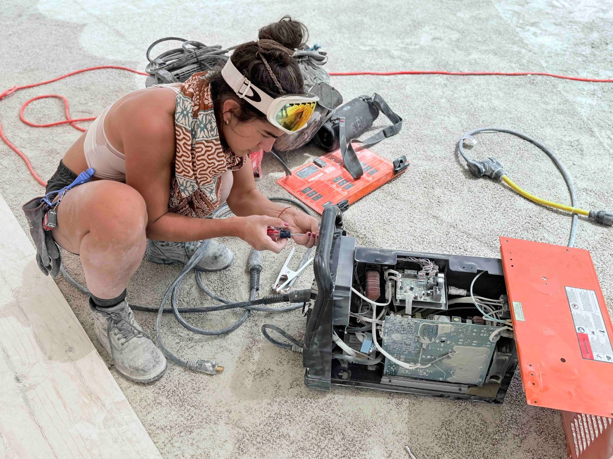
My new SpaceX engineer friend trying to repair the welder after the storm. In jest, I told her that she has welded rockets so she should be able to build me a new welder from scratch. It’s just electricity and metal after all. She told me I sounded an awful lot like Elon.
Other Photos
Notice the climbable fractal progression on the side of the E.
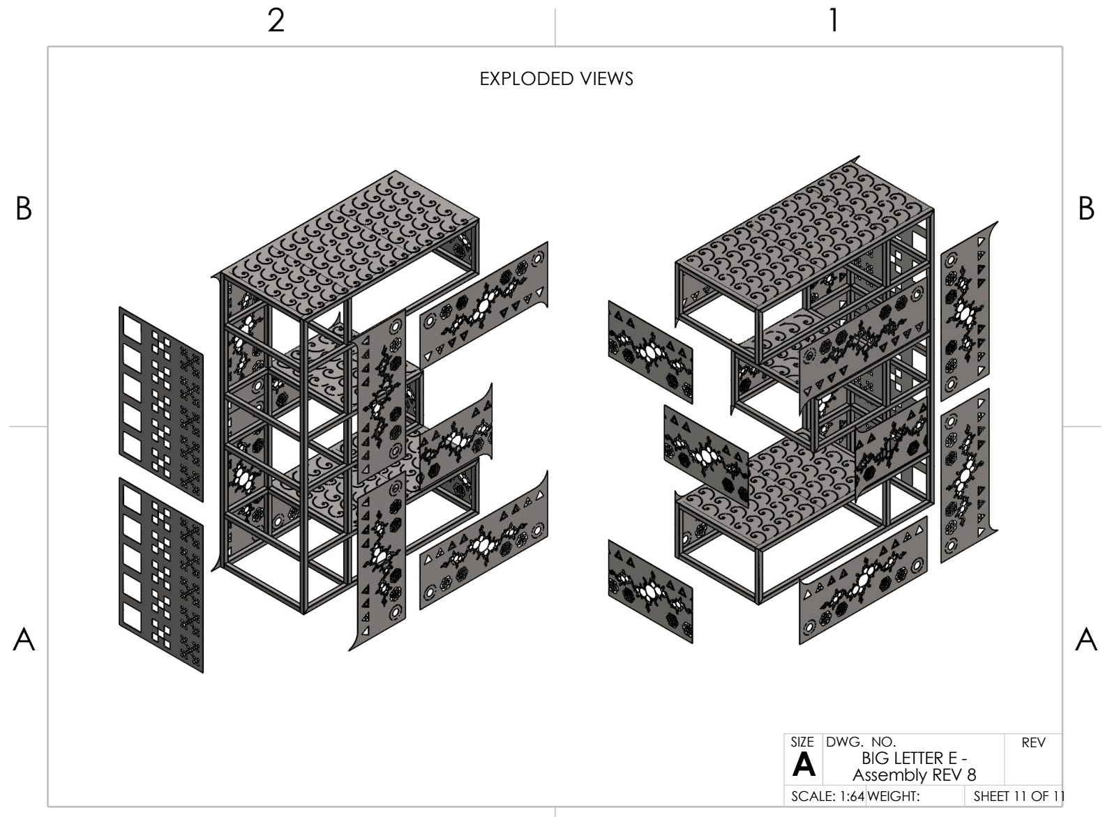
An example of Nate’s masterful CAD diagrams of the piece.
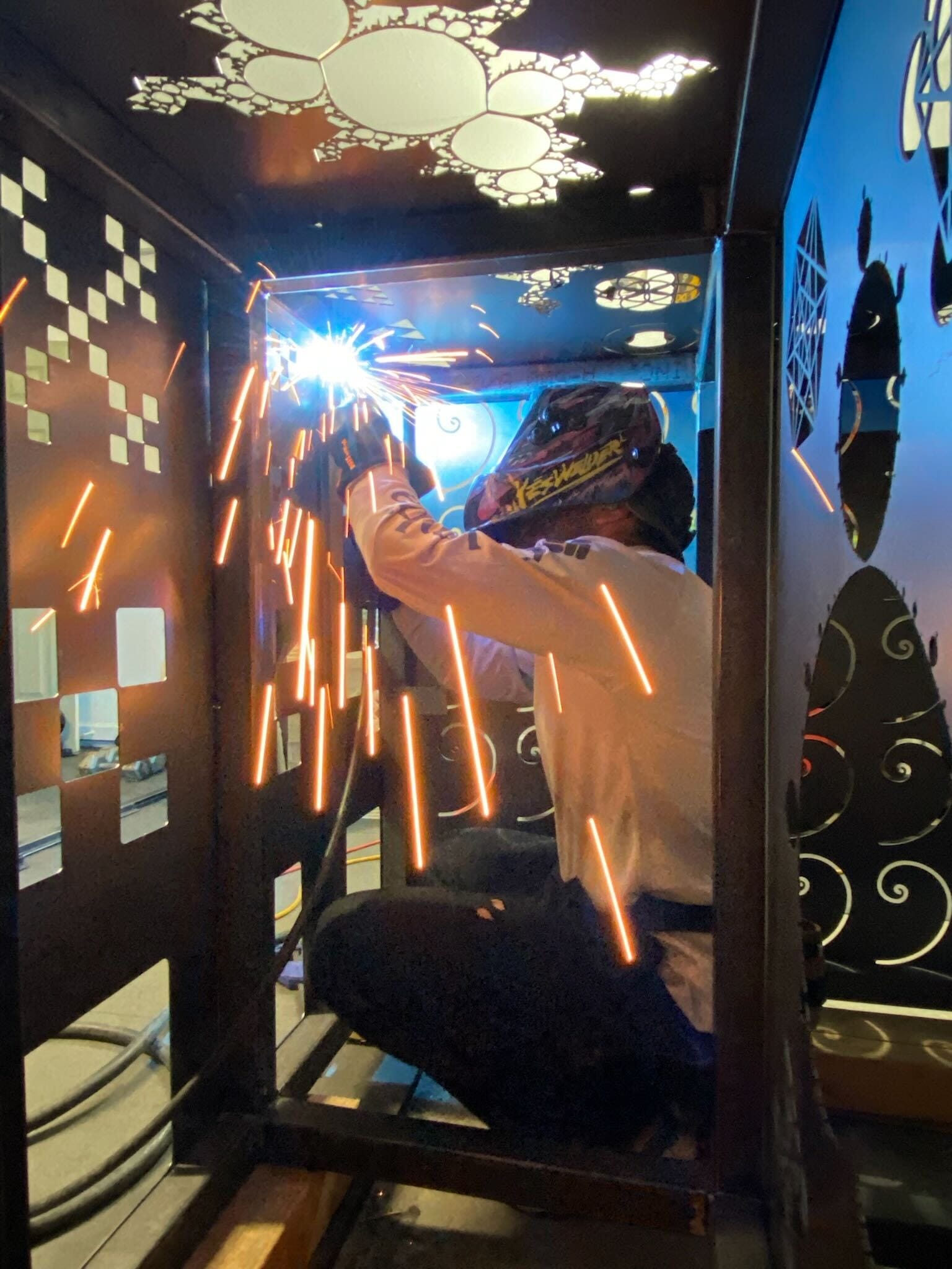
The build process.
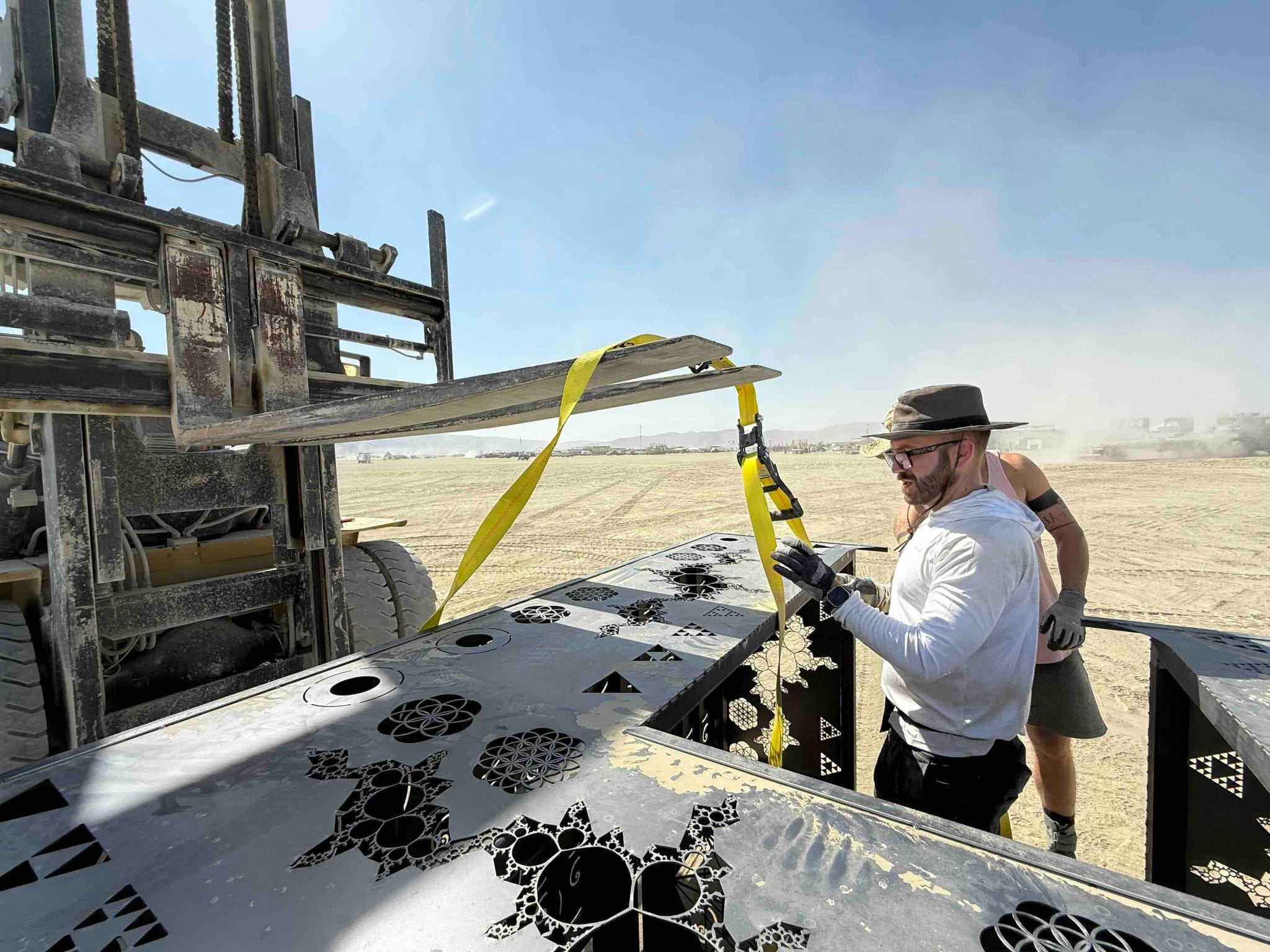
Forklifts and semi trucks to get the E set up.
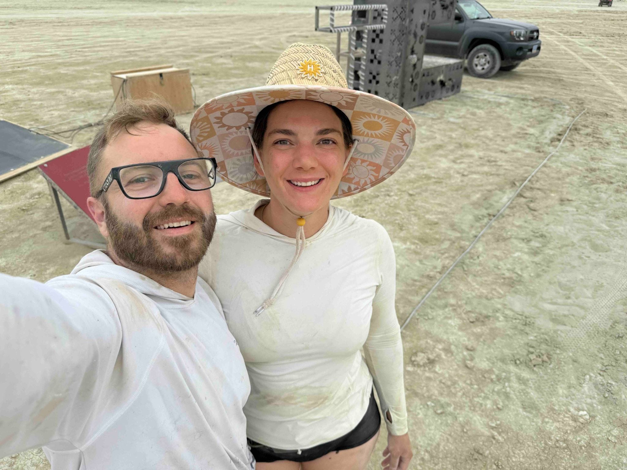
Madelyn and I after a day of building.
Sunrise at the art piece.
Leave no trace efforts. Amazing what metal shavings a magnetic rake will find.
Inspirations
As Banksy once said, good artists copy and great artists steal. (Ok, that was actually Picasso.) But let me break down some of the inspirations for this piece.
Straightedge: A decade ago, one of my all time favorite art pieces was brought to playa. It was called Straitedge. It consisted of a series of vertical poles stretching for 2.6 miles. On each pole was two lights flashing in unison along the whole line. One represented a straightedge placed on the earth and the other represented the curvature of the earth. At one end, the two lights were side by side. This was the point that the straightedge touched the earth. As you rode your bike along the line of poles, the lights would diverge until eventually the two lights were five feet apart. What I loved about this work was that it made an abstract natural phenomenon—the earth’s curvature—intuitively accessible. I tried to do the same thing in my art piece but with exponentials.
I’m Fine: Last year my favorite art piece was called I’m Fine. From a distance, it looked like typical burning man snark: a large sign that just says the words “I’m Fine.” But as you approach it, the meaning inverts. You see that the letters are made out of street signs from Ukraine with bullet holes and bomb blasts from the war. It was accompanied by an air raid siren linked in real time to sirens in Ukraine. The sign in front of it spoke to the commitment to be fine in spite of adversity. This inspired the aesthetic weirdness of the art piece with a different meaning from afar versus up close.
Believe: Jeff Schomberg and Laura Kimpton brought out many word signs to burning man over the years. In Reno, they’re best known for their large Believe sign. Many years ago–perhaps in 2015–I met Jeff on playa at his work where he asked me to press some buttons in front of the sign. At each push the top of the different letters would explode in flame. He also gifted me one of the dove cutouts from the steel sign. This was the main inspiration for the E.
Scale: In this book, Geoffrey West discusses fractals and their relationship to the scaling functions of biological organisms, cities, and companies. This fueled an early curiosity in fractals that informed the fractal progressions on the E. It also made me question why the default geometry taught in schools is Euclidian geometry rather than fractal geometry and makes me wonder how different the world would be if we taught children natural fractals before the unnatural shapes of triangles, squares, and circles.
Looking Forward
Seeing people interact with the art piece was deeply rewarding. There was the couple I found crying there saying how it resonated with them after a tough year. There was a small group that spent a good sunrise on top of the E, deepening their connection. There was the person who pitched me her new book idea on it and another person who pitched me his new movie. There was the startup founder for a more human social media platform who said it was his favorite piece that year. And the list goes on…
I loved the way this piece came together. Aesthetically, the final result looked a lot better than I had planned. I’m a heady dude, after all, and like most modern art I get enamored with concepts over aesthetics. I had wanted to do a deep dive into welding for some time and this gave me an excuse to learn. There’s something about the physics of metal and electricity combined with a bit of danger that really draw me in. I don’t know yet if I would bring this piece back out. If I do, I’d love to add a 22 ft tall exclamation point at the end that’s climbable, covered in programmable LED’s, and has a basket on top to watch the sunrise.
Regardless of its form, I’ll continue to iterate on the various ideas in this piece.
Acknowledgements
It takes a village. I’m deeply grateful to the following people for the help on this project:
Madelyn: In metalwork, the welder welds and the grinder grinds. Welding fuses together metal and the grinder cleans the welds so they look good. Madelyn was the master grinder turning my amateur welds into something halfway presentable. She was also with me every step of the way helping on everything from making design decisions and solutioning challenges to reminding me to eat and packing my clothes for burning man while I was focused on the build.
Nate: He’s an engineering savant. Nate has incredible breadth and depth as an engineer, mocking up 3D CAD diagrams as a hobby. Simulating the physics of this and reengineering that, Nate was an incredible thought partner and contributor to the project through and through. He was the main engineering mind behind the E and was responsive to my unceasing feedback of “that’s great, but can we add more math?” Men often catalyze friendships through shared projects and this was no exception.
Jeff: As mentioned above, Jeff is the master of word signs. His work can be found everywhere from Union Square in San Francisco to the Venetian hotel in Las Vegas and elsewhere across the US. Jeff was kind enough to invite me to his workshop, share the technical details of his process, offer shop space if I needed it, and give me feedback on my build.
Brad and his crew: Running one of the main transportation and storage operations for burning man, Brad put up with my relatively crazy request to pick up the E from my garage and transport it to and from playa. Tony, Adam and the rest of his crew were awesome to work with. They rolled up to my house with a forklift, pallet jacks, and a flatbed truck to transport it as well as helped me place it on playa. All while having a great time in the process.
Ken: I rolled up to playa not exactly having a plan for where the E would go after the burn. I mentioned it to Ken and he simply said “oh, you can just keep it at my house.” So now he has a giant E in his front yard and I have a good excuse to visit him.
The Artery: As the main resource for artists at burning man, the Artery did a great job getting me started, introducing me to the right people, keeping everybody safe from the storms, and checking in with me throughout the build and strike.
Pre-burn build: Madelyn, Mark, my parents
On-site build and leave no trace: Madelyn, Huub, Dylan, Alex, Andrew, Maral, Marc, Logan
Photography: McKinsey
Funding: the camp Elementum contributed 15% of the project’s budget. The rest was self-funded.
Thought partners: Kelsey, Marc
I'm so glad I read this. What an awesome contribution to the playa. So cool to read about how you brought it to life. I wish I climbed the E and pitched you a startup from up there... Next year?
Amazing work my friend! Thank you for building this beautiful and deeply meaningful piece! It was the first art I climbed this year :) If you can't climb it is it even art?